Follow Me

Close

Image via Martyn Lawrence Bullard

Get it?  Going “Stag”? We crack ourselves up sometimes.  But seriously, today we are going to talk about a new trend that is very “deer” to our hearts (oops, did it again).  It’s a trend that brings traditional icons into the modern age: using antlers and taxidermy in interior design.

Image via Cote de Texas

I think this trend is developing as an add-on to the rustic cabin/mountain lodge craze that we have been seeing over the past year.  And, just like with the cabin craze, it seems that people are re-creating a classic figure.  They are taking the deer head, a rustic lodge accessory that is steeped in tradition, and turning into something different that fits a newer definition of style.  Instead of seeing massive taxidermied elk glaring down at us with glassy eyes, we are seeing antlers incorporated into centerpieces.  We are seeing smaller animal skulls mounted on plaques.  We are seeing subtle signs of wildlife in the home that give us the overall impression of a rugged environment, without being visually assaulted by it.

Image via Pinterest

Now, if you are a lover of (live) animals, or are still scarred from that scene in Bambi (you know the one I’m talking about), don’t fret.  You can still hop on the stag-wagon… we’ll show you how.

Image via Pinterest

In many spaces, hunting trophies are actually being replaced by faux taxidermy. Wooden deer heads can be mounted over mantles, and statues can take the place of skulls.  Remember not to forego the purchase of antler accessories for “moral reasons”.  Did you know that elk actually shed their antlers every year?  In Jackson Hole, Wyoming, the Boy Scouts then collect these antlers and auction them off to fund their program, and that is where the majority of your antler products come from.

Image via Spring Creek Ranch

You can also consider other ideas to enhance your room, like bringing the deer off of the wall.  Using other stag accessories like pillows, throws, art, towels, etc. can really help you create a cohesive feeling in your space.

If you’ve just been absolutely dying to bring some modern tradition into your home, here are some ideas for you.  These are all products that we have in the Home on the Range showroom right now!  Don’t delay, or you could “deer”ly regret it (okay I’m done, I promise!)

Stag Pillow

Stag Tea Towel

Wooden Deer Head

Deer Sculptures

Plaque Mounted Antelope

The cabin is making its comeback this year.  The words “rustic”, “cozy”,”cabin”, “distressed”, “lodge”, “homestead”, and “reclaimed” have been sprinkled throughout websites like Pinterest and Houzz in the last few months.  However these are no dilapidated, public-use Forest Service cabins… no, these Boy Scout camps of the past have been given makeovers to become more sophisticated versions of their former selves.  People are taking the idea of a cabin and transforming it to become a reflection of their own unique personalities.

At Home on the Range, we couldn’t be more excited about this “new trend”.  Why?  Because we are cabin people and we always have been.  The rustic West is what we know and love, and it’s what we do best.  Cabins represent nostalgia, appreciation for nature’s beauty, and a simpler time and way of life. Cabin style fits right in with the rugged elegance of our Colorado surroundings, and we are long practiced in picking and choosing the remnants of the past, and incorporating them into something that is new and completely tailored to our clients’ Western lifestyles.

Below are some of our favorite cabin styles.  Are you as in love with cabins as we are?  If so, join our Pinterest group!  You can find our “Cabin Style” community board here.  Just leave a comment below this post (or on Facebook) and we will add you as a pinner to the new Home on the Range (Lynne Barton Bier) community board, where you can share all of your favorite cabin pins with us and the world.  You can also invite your friends!

  • To me this screened-in porch dining area really exemplifies a “cabin” with the chinked timber, stone, and reclaimed accents.  The candle chandelier adds an element of elegance that makes this cabin feel sophisticated and updated without detracting from the absolute coziness of this space.

Image via Home on the Range on Houzz


  •  People love cabins because they symbolize a retreat and escape from real life, and this cabin provides that escape in the most idyllic setting.  Don’t you think this looks like  heaven?

Image via Houzz

  •  This happy space gives a feeling of warmth and security, while still providing a prominent sense of the outdoors with its large picture windows.  The details in this room are fantastic, did you notice the camping lantern incorporated into the ceiling fan?

Image via Pinterest

  • In this room the old comes together with the new.  The chinked timber, reclaimed wood beams and traditional quilts compliment the chandelier and leather arm chairs in a subtle way that kind of makes you feel like a glamorous Laura Ingalls Wilder.

Image via Home on the Range on Houzz


If you have just been dying to cabin-ify your own life, be sure to stop into Home on the Range to see our handpicked collection of “Cabin Lifestyle Accessories”.

Do you ever just feel like you need to escape sometimes?  We all know the feeling: like you just need a little hideaway to curl up in with a good book, away from the rest of the world.  Not forever, just for a little while… in a space that is comfortable, calming, unique and special.

When you imagine your happy hideaway, do you picture it in the attic or a closet?  Probably not.  You probably conjure up dreams of deserted islands, tiny forest cottages, and other faraway fantasies, but you just might change your mind when you see some of our favorite in-home nooks and crannies.  The best thing about these special spots is that you don’t have to undergo a major remodel to achieve one.  In fact, you can create a super relaxing room of your own with almost any extra space you might have available… the more obscure and hidden in the house, the better.

Have an empty attic or crawl space?  We love these cozy hidden gems:

Image via Pinterest

Image via Houzz

What about a hall closet or pantry?

Image via Cheez Burger

Image via Joie De Vivre

You can even make a special reading nook right in plain sight… it could even be your own BEDROOM!

Image via R&R corner

There are a few important elements to keep in mind when creating your in-home escape.

  • Comfort is key.  Fill your cranny with pillows, blankets, bean bags, etc… as many as you can, floor to ceiling if you have to!
  • Style it up.  This is your very own special space, and you want it to be a calm, happy place to be.  If it’s filled with things that you absolutely love, then you will love escaping to it!
  • Function.  Make sure that you can actually use the space (i.e. you’re not trying to relax or de-stress in a 2×2 broom closet).  If your room is windowless, consider adding some extra lights to the room.  Unless you want to sit in the dark, and then that is up to you.

There are so many ways to make a special little nook in your home, if you need help with ideas, feel free to ask!  You can find us on Facebook, or at our showroom (where we have LOTS of hideaway friendly furniture and accessories.

9 Ways to Decorate with Pumpkins | Home on the RangeHalloween is finally here!  It’s easy to “fall” into the Halloween spirit when the leaves change and begin to drift off of the trees, the evening light develops a warm glow, the days become chilly and brisk, and the smell of wood smoke permeates the crisp autumn air.  Jack-o-lanterns, spiders, and ghosts start to dot the neighborhood landscape, and before you know it, Halloween has arrived.

We absolutely love this holiday, though our Halloween decorating style tends to fall somewhat short of super-spooky witches and ghouls.  If, like us, you are looking for a more natural and traditional looking Halloween display, pick up a couple (hundred) pumpkins from the store or pumpkin patch and read on.  We have put together a list of 9 ways to decorate (and decorate with) everyone’s most beloved holiday gourd.

9.  The Chevron Pumpkin: People are WILD for chevron this season, and what better way to venture into this fun pattern than by painting it on a pumpkin?  Keep it even more current by using white, gold, glitter, or a mix of all three to cover the creation.  You could also consider using different geometric patterns like herringbone, houndstooth, or a tribal print stencil.

Image via Feeling Lovesome

8.  The Pumpkin Stack: What a way to welcome party guests or trick-or-treaters!  I love the idea of the pumpkin stack- it looks chic and rustic with the tin bucket base, but it’s easy to make, and best of all it can say whatever you want it to!

Image via bhg.com

7. The Mumpkin: Get it? “Mum” pkin?  I love this pumpkin idea because it mixes a fall icon with the last remains of summer in a way that incorporates all of the colors of the season.  I have never seen anyone make mumpkins before, have you?

Image via Lowes Creative Ideas

6. The Pumpkin Planter: These are kind of the same idea as the Mumpkin, but a little bit simpler and more elegant.  You can use flowers, or almost anything else (like fall foliage branches or cat tails) to fill these pumpkin planters.  So many ideas!

Image via FYI Modular Homes

5.  The Pumpkin Entryway:  I LOVE this entryway.  The use of pumpkins of all different sizes, colors and materials provides a great holiday flare, while the hurricane lanterns and pedestals help to add a layering effect that creates a depth to this display that really makes it unique.  Crows are optional.

Image Via Sense-ational Living

4.  The Pumpkin Bowl: Throwing a Halloween party this year?  You can thank us later for this idea.  Everyone will love grabbing their snacks out of a pumpkin, and we think the bandanna inside adds the perfect touch of Western to the serving bowl.  We have also seen punch bowls inserted into hollowed-out pumpkins that make perfect cauldrons for serving your Witch’s Brew.

Image via bhg.com

3.  The Pumpkin Pillow: Not all of your pumpkin decorations have to be perishable.  These homespun pumpkin pillows add warm, rustic colors and textures to any space they occupy, and the best part is you can bring them out every year!

Image via Pinterest

2.  The Pumpkin Basket: Who would have thought?  Throw a pumpkin in a basket for an instant rugged look.  All the better if you can add a burlap pillow, pinecones, and a hurricane lantern.  I love this display because it shows how you can turn your existing outdoor furniture into an elegant fall scene with only a few simple additions.

Image via Opulent Cottage

1.   The Pumpkin Mantle:  Once again you can see how easy it is to transform your home landscape with a few simple touches.  This photo brings the outdoor display inside by adding small and medium pumpkins onto the mantle.  Paper flowers (or any wall decoration) add height and broaden the decoration area, extending it off of the mantle and giving the impression of a fully decorated space.

Image via A Place For US

We hope you enjoyed browsing this pumpkin extravaganza as much as we enjoyed creating it.  Home on the Range has everything you need to create these Halloween displays (except for the pumpkins), so stop in and see what simple accent pieces you can find to create a Halloween masterpiece today!

One more note: don’t hold us to this, but we heard that putting little silicon “do not eat” packets inside carved pumpkins will keep them from molding and rotting- give it a shot and let us know on our Facebook page if it worked for you!


home furnishings

Image via Houzz. Design by Culligan Abraham Architecture.

To honor National Home Furnishings Month this September, we’ve decides to share what we’ve learned from our education and decades of experience as interior designers. Here are Home Furnishings Do’s and Dont’s.

DO’S

  • Do purchase furniture with the intention of it lasting for decades. If you are on a budget, invest in fewer high quality pieces and incorporate new objects in the future.
  • Do Look for small accent pieces and accessories at flea markets and garage sales to help you stretch your dollar.  Use these accents to add some interest and color to your decor.
  • Do take your home’s architecture and locale into account.
  • Do purchase items that both you and your significant other agree on. Life is too short to have arguments over decorative details and you can generally come to a compromise that will work for both of you..
  • Do ask a professional interior designer for advice.  It will almost always save you from making mistakes in terms of scale, flow and color and consequently save you money in the long run.
DONT’S
  • Don’t blindly follow trends. Fashion magazines love trends because it encourages people to replace their wardrobe on an annual basis.  Home furnishings, while stylish, are a long-term investment, so embrace this season’s color or pattern only after you have decided that you will love it for years to come and use it only on items that are easily replaced like pillows, throws and small rugs.
  • Don’t buy a large piece without knowing where you will put it and what you will use it for.
  • Don’t give away a family heirloom just because you think it is out of style.  Styles change, but the pieces of your past have personal value forever and add a layer of interest to your interiors.

Take a look at the interiors of Bunny Williams, Mona Hajj and Martyn Lawrence Bullard to see how to integrate beautiful heirlooms with modern styles, ageless textiles and fun ethnic accessories.

For more ideas visit our Houzz page and to find a mix of heirloom quality furniture with fun accent pieces and textiles, visit us at Home on the Range Interiors in Steamboat Springs!

A national survey by House Beautiful found that blue was Americans’ favorite color.    In the mountains, we tend to gravitate towards the warmer hues of blue like the blue in the central pillow on the sofa below.  The addition of the reds and greens in the other pillows and accents adds a warmth to the room that would keep us feeling cozy during our long white winters!

Image via Pinterest. Design: Martyn Lawrence Bullard.


In an otherwise neutral room, a rich blue is a strong accent color. In the room below, Betty Burgess makes a statement with the blue chairs and then pulls the color back in as an accent in the vases on the mantle and fireplace hearth.

blue chairs

Image via Atlanta Homes & Lifestyles. Photo: Erica George Dines. Design: Betty Burgess. Architecrure: D. Stlanley Dixon

In the image below, the warm browns of the leather provide a perfect backdrop for the rich navy blue on the interior of the trunk and in the plaid of the pillow .

mountain design


For colorful images and more, visit our Pinterest page by clicking here!

To find out more about how the Home on the Range designers can help you with the color in your home, click the “like what you see” button on the right.

Olioboard

Mom's retreat by Selma Hammer - Image via Olioboard

You may have seen mood boards or renderings used by interior designers to convey a concept and material selection. Now homeowners can easily join in the fun with Olioboard. According to the trade newspaper Furniture Today:

Olioboard is an interior design-focused social media website that allows users to create online room settings using a library of more than 100,000 products.”  Even if you aren’t a designer, you can have fun creating boards on Olioboard.

Lets take a look at some of the engaging renderings you can create with Olioboard.

Keeping it "formal" - Image via Olioboard

Keeping it "formal" - Image via Olioboard


Romantic Balcony in Paris

Romantic Balcony in Paris - fun and whimsical! Image via Olioboard

We have been using Olioboard to show ideas to our clients because it is a great visualization tool.  We can upload pictures of the rooms we are working with along with the products we are recommending for a truly custom Olioboard presentation!  Here are a couple  of Olioboards we created for fun.

Here comes the sun

Lynne Barton Bier - Home on the Range Interiors Image via Olioboard

Cool, Calm and Collected

Lynne Barton Bier - Home on the Range Interiors Image via Olioboard

Take a look at some of out other creations on   Olioboard, or contact us if you have an idea for a room you would like help with!

Like the perfect wedding gown or made-to-measure suit, a turnkey installation is a full-service process where a designer listens to your vision and then creates a home that perfectly fits your style – down to the last detail.

Lake Catamount House by Home on the Range Interiors

Lake Catamount House by Home on the Range Interiors

Turnkey installations are perfect for second homes and busy homeowners who don’t have the time to spend on researching products and pulling the finishes together.  We use the term custom turnkey installation for the ultra-full service projects that we design because the homes look like the family that lives there. Our goal is to have our clients be overwhelmed with joy as they walk into their dream home. And it is their dream — Home on the Range is an experienced team of designers ready to take care of schedules and design details so that our clients can focus on what matters most to them– family,  friends and daily life.  All you have to do is describe your vision, and Home on the Range does the rest. On a set date, you are handed the keys and walk into a space where music is playing, candles are lit, and every detail is taken care of, down to the last hand-towel. The only thing you have to worry about is bringing clothing and a toothbrush. Time is valuable, and a custom turnkey installation saves you time and eliminates stress, at the same time providing you with a home where every detail is coordinated and well thought out.


Lake Lodge master bath complete with towels and accessories

It takes a knowledgeable staff with trusted trade resources to perform large turnkey installations in a relatively short period of time. Fortunately, the experienced design staff at Home on the Range has an efficient system that has enabled us to perform many custom turnkey installations over the past several decades. Best of all, each of these projects is fully customized, timeless, and unique.

Master bedroom with rugs, throws, sheets and bedding


We even set the dining table!

Do you have questions about custom turnkey installations? Contact us at Home on the Range so we can hear your vision for your unique home.


Architect:  Joe Patrick Robbins, AIA

Photographer:  Tim Murphy

All photos courtesy of Home on the Range Interiors

Mark Twain once wrote that sitting on a porch gave him “a deep sense of comfort and contentment.” The bard of American letters was not alone. Porches used to be where the family would hang out in the evening and visit with neighbors and watch the kids play in the yard.  It was a way to catch the evening breeze when there wasn’t any air conditioning.

porches for relaxing

Mark Twain. Image via Historic Saranac Lake


Porches still make inviting places to congregate and watch the world around you, which is why Home on the Range Interiors brings interiors outside with seating areas for conversation or for quiet contemplation.  Here are a a few porches from our varied projects.

This inviting porch off of the master bedroom wing provides a great place to relax and get some private time. Western Homestead Ranch - interior design by Home on the Range Interiors


Western Homestead Ranch Porch

This rustic ranch porch is the place everyone congregates in the evening as the sun goes down and the lake below the house glimmers in the evening light. Western Homestead Ranch - interior design by Home on the Range Interiors


Home on the Range Interiors

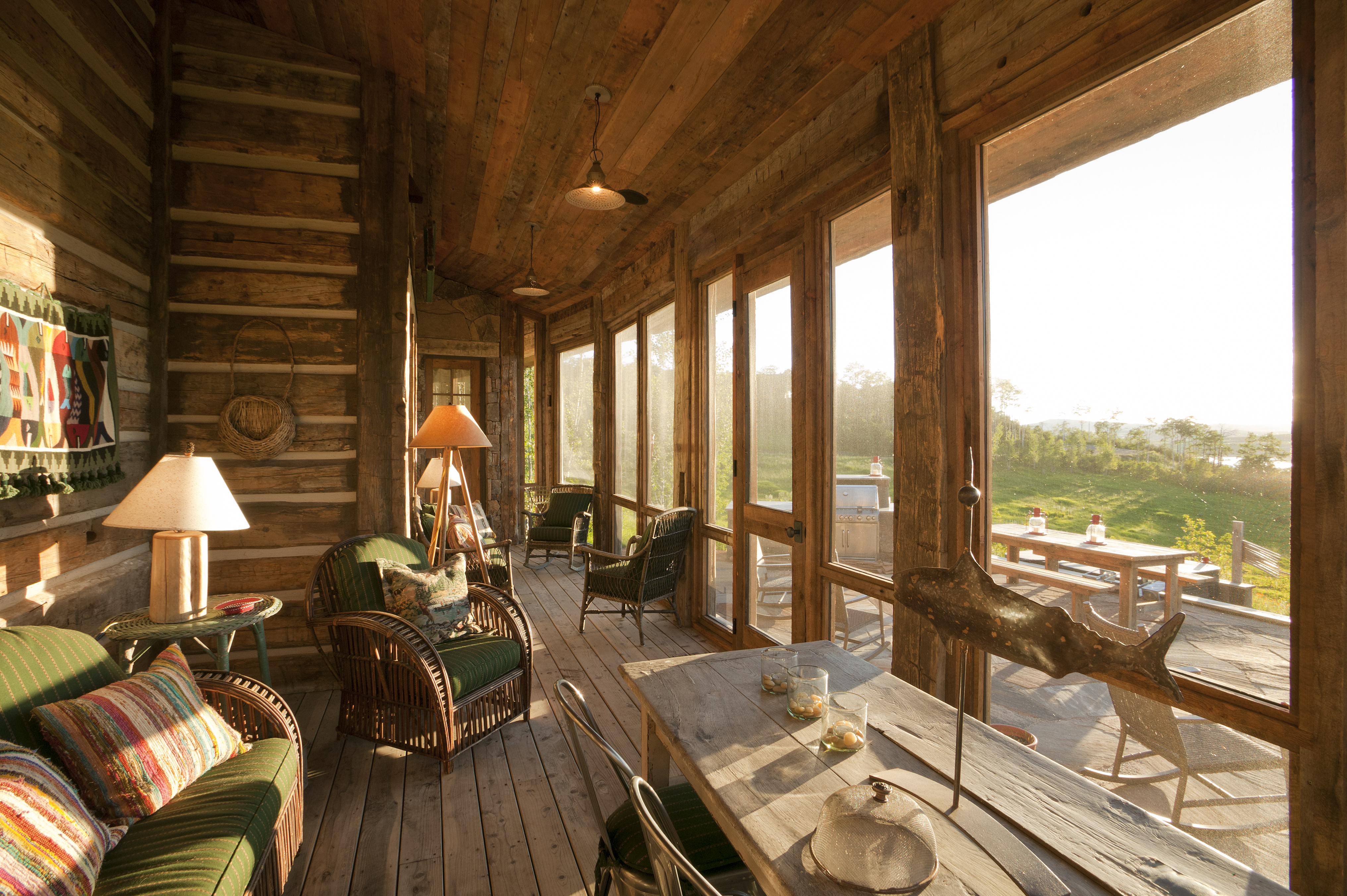
This screened in porch overlooking a meadow of wild flowers and Lake Catamount has both a dining area and seating areas for relaxing and conversing. Pioneer Homestead Ranch -interior design by Home on the Range Interiors


Cozy seating around an outdoor fireplace makes this lake cabin porch an inviting place to sit on a cool evening.


Here are some great porches I found on Houzz that are a little more “East Coast” than the porches we have in the mountains of Colorado but that have the same universal appeal.

I can just imagine sitting on this porch below reading a book or sipping an iced tea in the day or a mint julep in the evening as the neighbors stop by to chat!

porches for relaxing

Photo: Mark Lohman for Tumbleweed & Dandelion. Image via Houzz


Here is another great porch with a fireplace to take the chill off of the evening so friends and family can gather together after a busy day of hiking, fishing and boating.  It’s perfect for a lake environment because it is screened in to keep out the pesky mosquitoes!

porches for relaxing

Photo and design: Lands End Development. Image via Houzz


This reminds me of an old farmhouse porch where ma and pa would sit and rock in the evening after the chores were done.

porches for relaxing

Photo and construction: Witt Construction. Image via Houzz


Twain noted that “Each season brings a world of enjoyment and interest in the watching of its unfolding.” And what better place to gaze upon nature than a well-designed porch?

Which porch is your favorite?


Photos 2-4 via Home on the Range Interiors – Photographer: Tim Murphy Architect:  Joe Patrick Robbins,  AIA  Photos 5-8 via Houzz 

Home on the Range is currently working on a Frank Lloyd Wright inspired home designed by Architect Joe Patrick Robbins, AIA in Houston,Texas and we will be sharing details from the home throughout the construction process.  Wright’s appreciation for natural materials and the landscape make his Prairie Style homes timeless.  I am constantly amazed by the details he used 100 years ago that are currently popular in contemporary design.

Few individuals in history have had the honor of creating an architectural style. Frank Lloyd Wright changed the American landscape with Prairie Style, which he developed at the turn of the 20th century. The first Prairie Style structures were designed to “reflect the  long, low horizontal prairie on which they sat with low-pitched roofs (and) deep overhangs,” according to the Frank Lloyd Wright Foundation.  The other transformation attributed to the Prairie Style was the change from dark chopped-up rooms to open interior spaces with more light.   Below is one of the first Prairie Style residences, Wright’s Frederick C. Robie House in Chicago (1908).

Robie House

Robie House image via gowright.org

The home’s understatement and harmony with the landscape is quintessentially American. Another Prairie Style home with these characteristics is the Avery Coonley Housein Riverside, Illinois (1907). The landscape designer Frederick Law Olmstead did a wonderful job of further integrating the home into its surroundings.

Coonley Gardens

Coonley Garden


We find an overlap in style between Arts and Crafst style, Mission and Prairie style and will be using elements of all three in the Houston home.  Below are pictures of some of the inspirations we are using for cabinet design.

Arts and Crafts style shoji sideboard

Prairie style sideboard design

Prairie style sideboard designCraftsman Ceramic Tile Alchemy tileYamagiwa light fixture

Hardware example


Yamagiwa light fixture from Oak Park Home and Hardware

Examples of the Frank Lloyd Wright Prairie Style homes can be found throughout the United States.

Be sure to watch for the following key Prairie Style elements in our future posts on the Houston house.

  • Low-pitched roof
  • Overhanging eaves
  • Horizontal lines
  • Central chimney
  • Open floor plan
  • Clerestory windows