Color Use Across the Centuries
I have always been fascinated with color and it’s use in design, so on a recent trip through Europe I began to take pictures of eye-catching color combinations that repeat themselves in every country. I hope you’ll enjoy these photos as a visual reminder of how color use transcends both time and space.
This vibrant combination of red, blue and green adds life to what must have been a dreary existence in the Tower of London.
 Exquisite stained glass and colorfully painted columns – also in the Tower of London.

Great use of the red and blue again on shutters and awnings in the Montmartre area of Paris.
 Bookstall on the Left Bank of the Seine in Paris. Postcards from the Moulin Rouge show the same vibrant colors being popular at the turn of the century

Below are a number of houses on the fishing and lace-making island of Burano in Italy – the houses on Burano are painted in every color combination you can imagine, and it all works beautifully!!

 Another favorite color combination across the centuries has been purple, pink, blue and green – enjoy the below examples of these captivating combinations!
A shop window in the Latin Quarter and a Venetian glass chandelier.
 Sign on a children’s shop in Paris.
 Windowsill and flowerpot on a house in Burano, Italy.
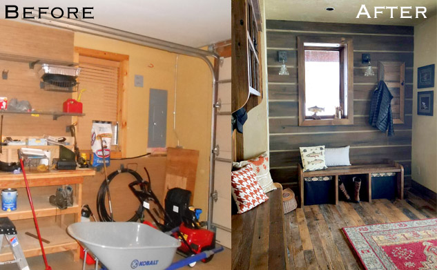
 Color inspiration is everywhere in our daily life, and, as there are endless combinations of colors, there are truly no right or wrong ways to combine colors. Each combination evokes a different emotion and the psychology of color is something we will be exploring in other posts such as our post on color in breast cancer treatment this month.
If you enjoyed this post, watch for future posts on such topics as color in Mexico and South America, the use of inlaid marble in Venice, unique staircases in Europe and things that make me smile!
And don’t forget to visit us at Home on the Range in Steamboat Springs or click the “like what I see” button to find out more about what we do.
—Lynne Barton Bier, Owner/Principal Designer, Home on the Range Interiors
- October 12, 2011
- 3 Comments
- 0

Grand Rapids Awnings
December 6, 2011These are exquisite! I love the color schemes. I found your website via Google while searching for a related topic, your website came up. I have bookmarked it in my Google bookmarks.
homeontherange
December 16, 2011Thanks you for your feedback - I'm so glad you enjoyed them!
homeontherange
January 14, 2012I'm so glad you found us! It's great to know how people are coming across our blog. I hope you will enjoy future posts as well.