Follow Me

Close

I have a very strong love for nature in design.  More than anything, I love rooms that take the outdoors and bring them in.  Where the boundary between interior and exterior is blurred, and you can visit the wilderness from the comfort of your own home.  Bringing nature into the home can be achieved in many ways, but today I want to share some beautiful spaces where people have literally broken down the barriers that separate us from the wild.


This bathroom looks and feels like it is part of the woods that live outside.  I love how they used natural materials and colors that mirror the forest outside the window!  The log column and bamboo wall are great accents here.

Nature in Design | Home on the Range

Image via Pinterest


This room isn’t actually a room, it really is outside, but I still love it!  This is the porch of a treehouse in France built by a helicopter pilot and his son, and the small cabin fits perfectly into its surroundings.

Nature in Design | Home on the Range

Image via V Magazine


If I had a dining area like this, I don’t think I would ever go anywhere else!  I love how the walls are open floor to ceiling, creating the feeling of being completely outdoors, while the ceiling provides protection and the reminder that you are still in a dining room!

Nature in Design | Home on the Range

Image via Pinterest


This little room looks so warm and comfortable.  Would be a perfect summer escape!

Nature in Design | Home on the Range

Image via Fall Universe


This bathroom really is half in, half out!  I absolutely love that there are plants and vines growing up through the floor and walls.  Tropical!

Nature in Design | Home on the Range

Image via I Love Acai


This room brings nature in without being completely exposed.  I really like the stacked log wall, and the opening in the center for the sun to shine through!

Nature in Design | Home on the Range

Image via Pinterest


This porch looks like the perfect spot to snuggle up and watch the snow fall!

Nature in Design | Home on the Range

Image via Pinterest


This last image might be my favorite.  In this house, there is nothing between you and nature!

Nature in Design | Home on the Range

Image via Pinterest

How do you bring nature into your home?  Share with us!  And, for more nature ideas, follow us on Pinterest!  You can also like us on Facebook to stay up to date with what we’re doing, and have daily design inspiration sent straight to your wall!


We love color.  Color drives the world and how we see it.  No one sees color in the same way, but nevertheless every color has some sort of strong significance to every single person in the world.  It’s amazing!  In interior design, we’re lucky to get to work with color on a daily basis.  We get to study it, enjoy it, and more interestingly, we get to learn how each of our clients view color in their own way.

This love of color has spurred us to start a series on color in design.  We will dedicate a post each week to a different color, and share some pictures that speak to and inspire us about each of them.

This week’s color is green!  Green is an easy color to talk about, especially where we live.  We have green leaves, green needles, green grass, green pastures, green rivers, green pastures, green everything!  For a while, it was a little bit harder to find green indoors, as the color had fallen out of favor in the design mainstream.  Thankfully though, we are watching it’s return, and in bold fashion!

Think of different shades of green, what do you see?  A cozy lodge fireplace room, a peeling farmhouse hutch, a wilderness walk, a velvet upholstered chair in the hunt club?  Something else entirely?  That is what is so beautiful about color, we can make it our own.

We would like to share some beautiful images of green, each very different in style and presence, but that all still embody one specific color.

Green Interior Design | Home on the Range

Image via Giants in Lifestyle


Green Interior Design | Home on the Range

Image via Pinterest


Green Interior Design | Home on the Range

Image via Pinterest


Green Interior Design | Home on the Range

Image via MFAB


Green Interior Design | Home on the Range

Image via The Buzz

What do you think?  Which photo, or shade of green, is your favorite? Which one speaks to you?  Share with us below in the comments, or on Facebook!  You can also follow us on Pinterest to see more color inspirations.  Next week’s color is Blue, so make sure and stop by for some more beautiful images, as well as tips on how to decorate with blue when you live in the mountains!


Let’s take a little trip today, shall we?  Around the world perhaps?  To a place buried in the sand, but steeped in culture and history.  A place where the landscape is stark, but the people are colorful and so are their creations.  Where nomads wander and converge and deal and trade. Let’s take a trip to Morocco.


Colors, textures and pattern are all integral pieces of Moroccan design.  Glass, ceramic, textile, wood, paint, dye, metal, and leather are all incorporated in these creations, and the more colors the better!

Moroccan Interior Design | Home on the Range

Image via Pinterest


Moroccan textiles are absolutely gorgeous.  They are known for their rugs, pillows, poufs and tapestries.

Moroccan Interior Design | Home on the Range

Image via Tranquility


Moroccan Interior Design | Home on the Range


Moroccan Interior Design | Home on the Range

Image via Pinterest


Moroccan Interior Design | Home on the Range


Color doesn’t always characterize Moroccan style though, sometimes it is pure and white, fresh and inviting.  Exactly what you crave when you’re in the Sahara desert!

Moroccan Interior Design | Home on the Range

Image via Pinterest


Moroccan Interior Design | Home on the Range

Image via Remodelista


I love the mix of materials in these poufs, look at the seashells inlaid into the tops of some of them!  Beads and sequins are often hand sewn onto these beauties.

Moroccan Interior Design | Home on the Range

Image via Eclectic Bohemian


Lights and lanterns are also well known items in Moroccan design.  They are generally made from glass and metal, and are all different shapes and sizes.  Aren’t they beautiful?

Moroccan Interior Design | Home on the Range

Image via Beers and Beans

Moroccan Interior Design | Home on the Range

Inlaid furniture and mirrors are another characteristic element of Moroccan style.  Traditionally done by hand, these pieces are always stunning and one of a kind!

Moroccan Interior Design | Home on the Range


Moroccan Interior Design | Home on the Range

Image via Pinterest

Moroccan Interior Design | Home on the Range

I hope you enjoyed our trip abroad today!  For more global inspiration, follow us on Pinterest!  You can also like us on Facebook to have daily design inspiration sent straight to your wall!  Or, if you are in the Steamboat area, come visit our showroom to see the Moroccan and Moroccan inspired pieces that we have in stock!


We have been getting ALL SORTS of new things at the showroom in the last few months!  Lamps, rugs, accessories, mirrors, and lots and lots of pillows… and more is on the way!  Here is a little smattering of some of the newest gems!


This is just one of the many beautiful rugs we have- all different shapes and sizes!

2x3-Embers-Rojo

This glass pine cone platter is really pretty!  We also have smaller “dipping plates” to match.

4598443291

We have lots of new adirondack twig and birch accessories, this is one of my favorites!

birch-bark-picture-frame-tree-4181850903

This is an Axis pillow- an Axis is an animal, have you ever heard of it?  The pillow is soft, and looks so neat and unique.

photo 1

How cute is this zebra print rug?  It’s not real zebra, it’s actually a printed cowhide.  Pretty neat!

photo 2

We got quite a few different types of vintage winter equipment- skis, snowshoes, snowshoe shelves, and snowshoe tables!  We’re pretty excited about them, they’re unique and perfect for Steamboat.

ss49-48x14_grande

This candle holder is made from old tequila barrels, and holds three round candles.  We are also getting one that holds 5 candles, as well as wall sconces and vases!

SONY DSC

This table-top is also made from an old tequila barrel.  It looks so great in person that we ordered four of them!

tn_1200_53f1de4b49d9fbdfbca0196b3bbb2ebc.jpg

We also love this deerskin pillow.  The fringe and beads are a great western accent!

WD1333 deerskin tan fiesta

This faux fur pillow and throw are called the “feathers” collection… isn’t that a great name?  They’re so soft and fluffy, that the name fits perfectly.  They will help add a creative texture to any space.

WD1894

This is only a small portion of our huge selection of new inventory, and more is coming (and going) every day!  Stop in today and let us help you pick out the perfect accents for your home!  Click here for hours, contact info and driving directions!

Can you read the title of this post?  It’s okay if you can’t, I just made it up.  I combined the words rustic and eclectic because I thought it best defined one of my very favorite styles of design.  Rusticlectic spaces are beautiful and unique, and no two are alike because the combination of design and materials are so unique and personal.

There is nothing that particularly classifies a “rusticlectic” space, but you will know one when you see it.  They can be colorful, or neutral.  They can be bold or subtle.  One thing that they do all have is a glorious mix of materials.  These spaces can mix rustic, modern, cabin, contemporary, southwest, cottage, minimalist, lodge, shabby, chic, bohemian, you name it.   Are you still wondering what a rusticlectic room might look like?  Here are some of my favorite examples!


What this room lacks in color, it makes up for in style!  It mixes western cow skulls and laced leather pillows with a more western contemporary sheepskin throw and burlap barrel shades, with a native throw pillow, a bohemian woven swing, and to top it off a farmhouse crocheted quilt!  Beautiful!

Rusticlectic Room | Home on the Range


This space is a prime example of mixing materials.  I love the layered rugs (though they’re not for everyone they can look beautiful in the right space!), and the mismatched chairs- it’s neat how the chairs are the same style but with different finishes.  The white brick on the wall helps to lighten the room and add another textural dimension!


Rusticlectic Room | Home on the Range


Here are some “rusticlectic” soft goods- colorful and cultural with a rustic feel


Rusticlectic | Home on the Range


Rusticlectic | Home on the Range


Here’s another room without a lot of color that still packs a big punch.  The reclaimed wood with the whitewashed ceilings and walls is a great contrast.  Here we see fur, fair isle, and Suzani-ish patterns come together with a rustic industrial twist.  Love it!


Rusticlectic Room | Home on the Range


This room is a little bit more on the shabby side of chic than I normally prefer, but I love the concept!  Barnwood, colorful prints, and a bold rug look great, and so does the “photo wall”!


Rusticlectic Room | Home on the Range


Here is a beautiful rusticlectic room!  I love the colors and the canopy mixed with the rustic shutters and reclaimed accents- it looks like an old gypsy caravan built right into the house!


Rusticlectic Room | Home on the Range


This room combines almost everything that rusticlectic has to offer!  Modern lines on the furniture transition to ethnic prints scattered throughout.  The woodburning fireplace, leather pillows and reclaimed floor help to drive home the rustic aspects of this living room, and the whitewashed wood walls and ceiling provide a cozy cottage feel!  I bet each accessory has it’s own special story!


Rusticlectic Room | Home on the Range

Welcome to the wonderful wold of rusticlectic!  Don’t be surprised if Houzz adds it as a new category… just remember that you saw it here first!  Haha!  What term best describes your favorite style?

For more decorating style, and “rusticlectic” rooms, follow us on Pinterest!  You can also like us on Facebook to stay up to date with trends and happenings, and to get daily design inspiration delivered straight to your wall!

Guess what?  We are currently help renovate and remodel an old bunk house near Estes Park, CO!  The house is super funky, crazy and unique.  It began as one very small building that was a livery (where animals are kept and boarded) years and years and years ago.  From there, new rooms were added one by one, so each room is on its own level, with its own ceiling height, and it’s own shape and angle!  It’s crazy!  But so much fun to work on- we get to come up with ideas to update the bunk house, while at the same time keeping it funky and historical.  Here are some of the design inspirations we’re using!

Image via Home on the Range


For more bunk house inspiration, follow us on Pinterest, Facebook and Houzz!


Well we’re still not quite there yet.  Here in Steamboat it was dumping snow yesterday, but we are definitely having more and more nice days, where the temperature gets up to 40 or 50 degrees!  To us, that feels like a balmy 70 or 80, and it’s not unusual to see people in shorts this time of year!  As always, I am daydreaming away of the time when I can put on my own shorts (I should mention that I’m not part of the Polar Bear Club), and take a stroll by the river and pick some daffodils.  Like I said though, not quite there yet.

I think that a lot of other people must be feeling the same as I do, because all around social media I’m seeing spring fever carried over into decor.

Soft pastels,

Colorful Bottles | Home on the Range


Springtime Decor | Home on the Range


open windows,

Springtime Decor | Home on the Range

light and airy spaces,

Springtime Decor | Home on the Range

plants and flowers,

Springtime Decor | Home on the Range


Springtime Decor | Home on the Range

I love springtime decor!


To continue with us on our adventure into Springtime, follow us on Facebook!  You can also find us on Pinterest for more beautiful inspiration for every season!


In our last post, we talked about how important small details can be in the overall scheme of design, and how sinks contribute so much bang for your buck.  We shared why we love farmhouse sinks, as well as some really neat unique variations on the traditional farmhouse sink.  Today, we’re doing the same thing with trough sinks!  What is a trough sink, you ask?  Well, let me start by saying that you will know it when you see it!  But, to give you some background info, a trough sink (pronounced like “off” with a “tr” at the beginning), is called such because it emulates a food trough that farmers and ranchers use to feed their animals.  It is long, with multiple faucets, and while it can be similar to a farmhouse sink, it is usually set into the counter-top and lacks the apron that characterizes it’s farmhouse counterpart.  We love trough sinks because they bring a fantastic rustic vibe to a space that no “normal” sink ever could.  They transport you directly back to the ranch, without ever having to leave your own bathroom!

Today we’re going to share some fantastic trough sinks.  Some of them are traditional troughs that fit seamlessly into their environments, and others are unique twists on troughs that add a big bang to their space.


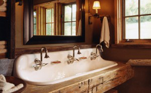
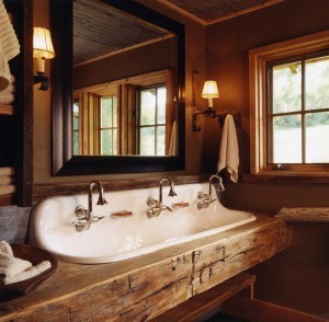
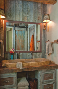
This is the most common version of the trough sink.  See, I told you you’d recognize it!  It looks beautiful here set into the hand hewn wood vanity top, and the more finished mirror frame and sconces add a nice contrast of styles… very elegantly rustic!

Trough Sink | Home on the Range

Image via Pinterest


This is a western bathroom from one of our projects located at the Steamboat ski-area.  Here, the trough sink completes the rustic barn feel with ease and style!

Trough Sink | Home on the Range

Image via Home on the Range


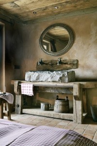
The stone trough sink on the chunk work bench vanity, along with the plumbing, backsplash, mirror, and textured walls make for an absolutely incredible space.  There are no words for this- it’s beautiful.

Trough Sink | Home on the Range

Image via The Gifts of Life


Here’s another fun and funky bathroom with an unusual twist on the trough sink.  It looks to me like a giant old dough-bowl.  All of the different components create a look that is rustic all the way!  What do you like about this bathroom?

Trough Sink | Home on the Range

Image via Ragland Hill Social


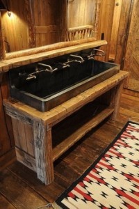
This final trough sink was hand forged by a blacksmith.  It doesn’t get any more unique than that!  It fits in so beautifully with the also hand hewn beam vanity, and once again the contrasts here really add interest!

Trough Sink | Home on the Range

Image via Pinterest

These sink posts have been one small example of how important the little details can be to the overall outcome in design.  Whether it’s rugs, hardware, plumbing, lighting, furniture or finishes, each element should be well thought out and carefully selected if you want your end result to be just perfect!

For more rustic rooms, sink ideas, details and tips, visit us on Pinterest, or follow us on Facebook!  To learn more about details and design services, contact us today for a consultation!


At Home on the Range, we are detail people.  While we know that the “big picture” is important, we also know that it is the tiny details that actually make up the big picture.  We try to focus on every tiny thing in the space, including fixtures, finishes, trim, flooring, furniture, fabric, leather, accessories, materials, etc, because we know that each one of these things contributes to the overall feel of the room, and if the details don’t work together, then the “big picture” is flawed.  Little things that seem insignificant, like sinks, light fixtures, and hardware, can make or break your space.  We love creating rustic, western, and mountain designs, and farmhouse and trough sinks are great additions to these themes.  Today I want to show you some great examples of some sinks that don’t detract from or neutralize their spaces, but instead contribute a huge style element that would otherwise be overlooked.


Just for fun, we’ll start out with the most traditional farmhouse sink.  The deep bucket with an apron across the front is what characterizes a farmhouse sink, though these days there are so many creative variations on the original!

Farmhouse Sink | Home on the Range

Image via Remodelista


Here’s a great example of a “creative variation” on a farmhouse sink.  You can still see the deep bucket and “front apron”, but I love how they used galvanized tubs instead of a single porcelain sink.  What a fun look!

Farmhouse Sink | Home on the Range

Image via Livin’ Easy


This is a bathroom version of a traditional farmhouse sink.  They did a great job of incorporating the apron into the vanity, and the contrasting colors of the vanity, sink and mirror look beautiful together.

Rustic Trough Sink | Home on the Range

Image via Cabinspiration


Here’s another unusual sink- I don’t know if it could really be called a farmhouse sink or not, but I’m still including it in this post because I love it and I think it has the same feel!  Again the use of galvanized metal transports you to a farm or ranch bathroom, and the rivets on the sides add a great visual element too!

Farmhouse Sink | Home on the Range

Image via Givonehome


For more fun and creative design elements, follow us on Pinterest!  You can also like us on Facebook to have daily design inspiration delivered straight to your wall!  Stay tuned for our next post, which will talk about trough sinks, which are another kind of sink that we love to use!


Today we are lucky to have a guest post from Naomi Shaw on the differences between wallpaper and paint, and why you should know about them! Thanks Naomi!


New wallpaper and a fresh coat of paint are both excellent ways to make your walls look new and your décor shine. However, while they’ll both look great for a while, and they’ll both serve your décor if chosen properly, making the decision between wallpaper and paint isn’t always as easy as it seems.


Use these tips to help you decide what’s best for your home and your walls.

paint buckets

What’s the Weather Like?


The weather doesn’t have anything to do with what you choose to put in your home or on your walls, right? After all, you have air conditioning and you use the heater in your winter to keep your home comfortable and toasty.


The truth is that the weather in your area and around your home really does make a difference when it comes to whether you should choose paint or wallpaper.


Peeling Wallpaper


In areas where you have high humidity, wallpaper is likely to start peeling before you’re ready to replace it. So if you have a home in Florida where it is very humid, it is something you need to take into consideration, as it could start to pull away from the walls and turn into a costly repair job.


Paint isn’t as likely to be affected by weather as wallpaper, so in areas where humidity is very high, it’s generally a better choice. If you want texture, choose faux-finish or specialty paint.

Faux Finish Paint | Home on the Range

Consider Your Walls


The material used to make your walls isn’t something you’ve likely considered too much unless you built your home. However, not all homes use the standard drywall that you see in most houses.


If you live in an older home, there’s a good chance you have plaster walls. While plaster is great for keeping your home a pleasant temperature and blocking sound, it doesn’t always hold up to wallpaper chemicals and the damage it can go through when the wallpaper needs to be stripped.


Plaster Walls | Home on the Range

Image via Locati Architects

If you’re going to put wallpaper up on your plaster walls, make sure they’re strong and you don’t use abrasive adhesive. Otherwise, sticking with paint is your best bet.

Selling Soon?


Perhaps you just bought your home and you’re planning to stay put for as long as you can imagine. If that’s the case, choosing wallpaper or paint doesn’t have much to do with what potential buyers might want.


If you’re considering putting your home on the market soon, however, you may want to reconsider wallpaper, as many buyers are concerned with mold buildup since wallpaper doesn’t “breathe” quite like paint. This is especially true if you live in a humid area.


Paint is also the more common choice among home buyers, so you’ll want to keep that in mind. Wallpaper might even negatively affect your ability to sell your home as quickly as you want to.


Deciding what’s right for your home, wallpaper or paint, is a personal decision, and it’s one you’ll have to live with. However, taking the factors presented above into consideration is important.


If you don’t make the right decision, you can always go the other way later on, but it could be a real inconvenience and expense that you wouldn’t otherwise have.


Naomi Shaw is a freelance writer who resides in Southern California. She loves to write about home decor and home renovation. In her free time she likes to find new DIY crafts and hang out with her 3 children and husband.