Pantone’s Spring 2013 Color Report
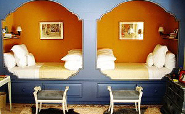
The Pantone Fashion Color Report Spring 2013 is out already! The report, released on the first day of New York’s Fashion Week, is a comprehensive overview of the colors fashion designers are using. We anticipate the colors will make their way to home fashion in the next year. The collection is all about balance, says Leatrice Eiseman, executive director of the Pantone Color Institute, in an excellent online video. Novel neutrals like “Linen” balance out exuberant colors like “Poppy Red” and “Lemon Zest”. The collection is visually “anchored” by Monaco Blue, which is dark. The Collection was formulated with the input of fashion designers such as Nicole Miller and Charlotte Ronson.
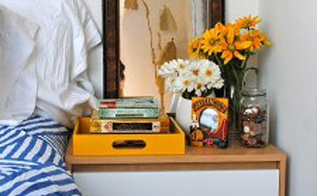
Fashion is the theme of High Point Market this fall, and here are some objects that incorporate colors similar to those Pantone released. The draperies and pants in this High Point Market video have a color combination similar to Pantone Spring 2013.
Watch for an upcoming post to get my personal take on which colors will be big in the mountain resorts in 2013 and why!
- October 6, 2012
- No Comments
- 0
