Color Inspiration- Blue
Last week we began a journey into the world of color. We started with the color green, and shared some unique images of different shades and styles of the same color.
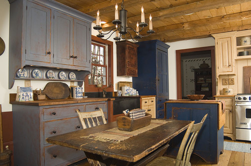
This week, we’re going to move on to the color blue. Blue is both beautiful and tricky. It can be very serene and comforting, and it can also be cold. Cool colors work well in warm areas, but in areas where it is cold, snowy and white for a good portion of the year, blue can often seem cold and stark. That doesn’t mean that it can’t work though! We just have to be a little bit more careful in the mountains in how we incorporate blue into our design. There are a few different tricks for incorporating different styles of blue into cold-weather design, and they can make any blue room warm and inviting.
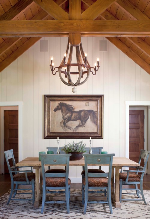
First, blue occurs in nature all the time. Since we live in the mountains, using local, natural blues can help keep a more comfortable feel year round.
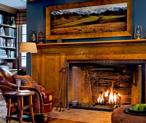
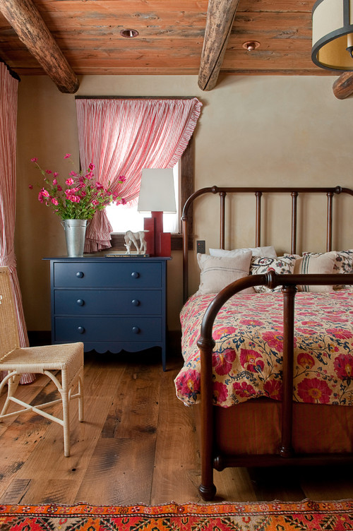
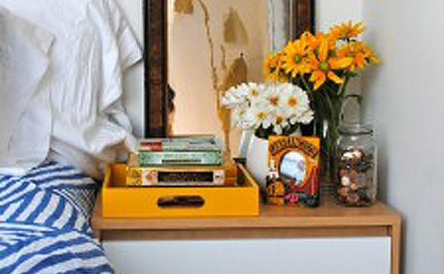
Next, using only a POP of a bright blue here and there can be much more effective than painting walls blue, or using the color in large areas. A small pop actually provides a fun and bold aspect, rather than an overall cold feeling.
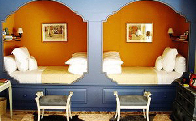
Finally, incorporating blue with other warm colors is the best way to keep warm in the cold months. Rather than using blue and white, try blue and cream, blue and ivory, or blue and almost any other warm color (we have a lot of Broncos fans around here who are proud supporters of blue and orange, but we don’t necessarily suggest that in your home color scheme!)
- April 18, 2014
- No Comments
- 0


