So I know we are still a few weeks off from Easter, but today IS the first day of Spring! Hooray, we finally made it! Although I do hear it’s supposed to snow 5-10 inches in the next couple of days. Everyone else seems to be feeling the Spring spirit too, because we’ve been seeing inspiring images all over the place. Warm colors, light pastels, fresh textures- what a beautiful way to begin to usher in the warm weather! I have been seeing so many images that I love, that I just had to collect them all into a post to share with you, I hope they inspire you as well (even if you do end up looking at them during an upcoming blizzard).

Image via This is Glamorous

Image via Cottage Mommy

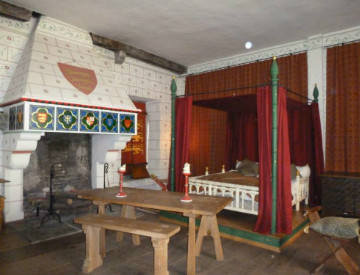
Image via House Beautiful

Image via Etsy

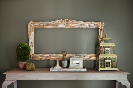
Image via Pinterest

Image via I Just Might Explode

Image via Soft Surroundings

Image via Pinterest

Image via Selina Lake

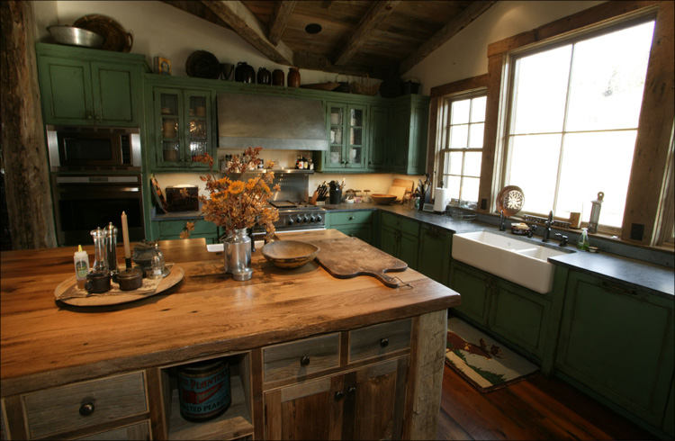
Image via House Beautiful
Wasn’t that pretty? Stay tuned over the next few weeks, we’ll have lots more springtime coming! From decorating tips to cleaning tips, we’ll have you covered this Spring season!
- March 20, 2013
- No Comments