Follow Me

Close

At Home on the Range, we love color!

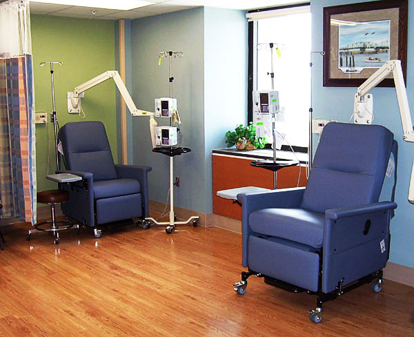
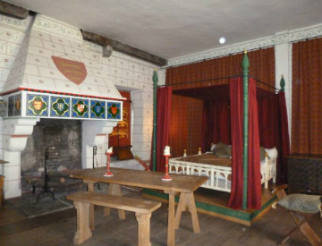
Take a look at the two rooms below to see how the paint color sets the mood, from fun and lively to calm and serene.

We definitely agree with Laura Martin Bovard, who told Decorati Access:

“More than just about any other design element, paint color can make—or break—a room. The first factor [to] take into account is how the room will be used.”

Likewise, we determine how a room will function, along with our clients’ favorite colors and how they want their space to feel. Asking to see a client’s wardrobe helps us narrow down the colors they enjoy on a daily basis.

Selecting a paint color involves more than just picking a shade on a paint chip. We choose the color based on all the finishes that will appear in the space, and try out a bit of paint on the wall to make sure it looks great at every time of day.

Home on the Range recently repainted the interior of a new house for our clients who were savvy enough to realize the original paint color was affecting how they felt in their home. Not only did the wall color make their skin look grey-green, but it also fought with other elements in the house, including the trim and flooring.  The clients thought the trim would need to be replaced but once the new paint color was on the walls, they decided they could forego the expense of replacing the trim!

Paint color influences our behavior and mood. Curious about the psychological effects of paint in various rooms of your house? Check out this fascinating article.

What are your favorite colors, and how do you use color in your life?

Photos by Tim Murphy; Interior Design by Home on the Range

October is National Breast Cancer Awareness Month, so the design community has taken to helping the cause in a variety of ways.

The first is by developing a number of pink products with partial proceeds going to breast cancer research, including BoConcept’s “Running Ribbon” cup and the Pink Swan Project by Suite New York.

Another way designers are getting involved is by volunteering time and materials to redecorate chemotherapy rooms. RoomsThatRock4Chemo is a San Francisco-based nonprofit organization that is devoted to creating positive and uplifting spaces that spiritually support cancer patients who are undergoing chemotherapy by revamping bland spaces into vibrant, warm and peaceful environments.

Breast cancer patients should be surrounded by things that soothe and promote relaxation, including color, and greens and blues in particular tend to be calming. In fact, one article notes that green “carries associations with nature, growth and recovery,” and another says that in chromotherapy, “blue was believed to soothe illnesses and treat pain.”

This color psychology explains why we’ve seen blue and green appear in many chemotherapy rooms, whether in the furniture, fixtures or walls themselves.

So, where pink helps raise money for cancer research, greens and blues help in the breast cancer treatment and recovery phases!

We love that people are supporting the cause by purchasing pink décor for their homes and that the interior design industry is instrumental in working with other colors that can also help pink in its fight against breast cancer – staying involved is the best way to make a difference!

Photos: 1 via shorehealth.org; 2 via lauranell.com/life/the-chemo-journey-begins

I have always been fascinated with color and it’s use in design, so on a recent trip through Europe I began to take pictures of eye-catching color combinations that repeat themselves in every country.  I hope you’ll enjoy these photos as a visual reminder of how color use transcends both time and space.

This vibrant combination of red, blue and green adds life to what must have been a dreary existence in the Tower of London.

Exquisite stained glass and colorfully painted columns – also in the Tower of London.

Great use of the red and blue again on shutters and awnings in the Montmartre area of Paris.

Bookstall on the Left Bank of the Seine in Paris.  Postcards from the Moulin Rouge show the same vibrant colors being popular at the turn of the century

Below are a number of houses on the fishing and lace-making island of Burano in Italy – the houses on Burano are painted in every color combination you can imagine, and it all works beautifully!!

Another favorite color combination across the centuries has been purple, pink, blue and green  – enjoy the below examples of these captivating combinations!

A shop window in the Latin Quarter and a Venetian glass chandelier.

Sign on a children’s shop in Paris.

Windowsill and flowerpot on a house in Burano, Italy.

Color inspiration is everywhere in our daily life, and, as there are endless combinations of colors, there are truly no right or wrong ways to combine colors. Each combination evokes a different emotion and the psychology of color is something we will be exploring in other posts such as our post on color in breast cancer treatment this month.

If you enjoyed this post, watch for future posts on such topics as color in Mexico and South America, the use of inlaid marble in Venice, unique staircases in Europe and things that make me smile!

And don’t forget to visit us at Home on the Range in Steamboat Springs or click the “like what I see” button to find out more about what we do.

—Lynne Barton Bier, Owner/Principal Designer, Home on the Range Interiors