Follow Me

Close

Today we are lucky to have a guest post from Naomi Shaw on the differences between wallpaper and paint, and why you should know about them! Thanks Naomi!


New wallpaper and a fresh coat of paint are both excellent ways to make your walls look new and your décor shine. However, while they’ll both look great for a while, and they’ll both serve your décor if chosen properly, making the decision between wallpaper and paint isn’t always as easy as it seems.


Use these tips to help you decide what’s best for your home and your walls.

paint buckets

What’s the Weather Like?


The weather doesn’t have anything to do with what you choose to put in your home or on your walls, right? After all, you have air conditioning and you use the heater in your winter to keep your home comfortable and toasty.


The truth is that the weather in your area and around your home really does make a difference when it comes to whether you should choose paint or wallpaper.


Peeling Wallpaper


In areas where you have high humidity, wallpaper is likely to start peeling before you’re ready to replace it. So if you have a home in Florida where it is very humid, it is something you need to take into consideration, as it could start to pull away from the walls and turn into a costly repair job.


Paint isn’t as likely to be affected by weather as wallpaper, so in areas where humidity is very high, it’s generally a better choice. If you want texture, choose faux-finish or specialty paint.

Faux Finish Paint | Home on the Range

Consider Your Walls


The material used to make your walls isn’t something you’ve likely considered too much unless you built your home. However, not all homes use the standard drywall that you see in most houses.


If you live in an older home, there’s a good chance you have plaster walls. While plaster is great for keeping your home a pleasant temperature and blocking sound, it doesn’t always hold up to wallpaper chemicals and the damage it can go through when the wallpaper needs to be stripped.


Plaster Walls | Home on the Range

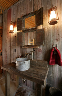
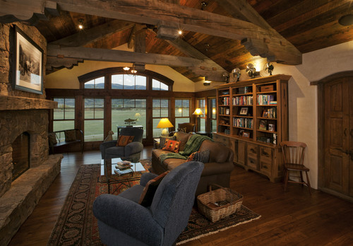
Image via Locati Architects

If you’re going to put wallpaper up on your plaster walls, make sure they’re strong and you don’t use abrasive adhesive. Otherwise, sticking with paint is your best bet.

Selling Soon?


Perhaps you just bought your home and you’re planning to stay put for as long as you can imagine. If that’s the case, choosing wallpaper or paint doesn’t have much to do with what potential buyers might want.


If you’re considering putting your home on the market soon, however, you may want to reconsider wallpaper, as many buyers are concerned with mold buildup since wallpaper doesn’t “breathe” quite like paint. This is especially true if you live in a humid area.


Paint is also the more common choice among home buyers, so you’ll want to keep that in mind. Wallpaper might even negatively affect your ability to sell your home as quickly as you want to.


Deciding what’s right for your home, wallpaper or paint, is a personal decision, and it’s one you’ll have to live with. However, taking the factors presented above into consideration is important.


If you don’t make the right decision, you can always go the other way later on, but it could be a real inconvenience and expense that you wouldn’t otherwise have.


Naomi Shaw is a freelance writer who resides in Southern California. She loves to write about home decor and home renovation. In her free time she likes to find new DIY crafts and hang out with her 3 children and husband.


If you read our post last summer, or are familiar with Frank Lloyd Wright, you know that he was a brilliant yet controversial architect who was ahead of his time in terms of his design concepts.  His work is recognized globally and, over the course of his life, he designed a wide array of commercial and residential buildings, from  “Pottery House” in Santa Fe, to  “Falling Water”  in Pennsylvania, to the fabulous Guggenheim Museum in New York City.  He was the father of the “Prairie Style” of architecture, which is characterized by linear shapes, unusual geometric details, long, leading, horizontal focal lines, and an open floor plan.  Although Frank Lloyd Wright is gone, his contributions to architecture remain and have an ever-widening following.  The “Frank Lloyd Wright Style” of design is compelling and iconic.

In the 7 months since our last post, the home in Houston, designed by Steamboat Architect, Joe Patrick Robbins, AIA  has come to life!  We promised to share pictures of the construction, showing some of the details that are trademarks of the Prairie Style; deep overhangs, clerestory windows, open floor plans and linear lines in the exterior materials, so you can stop holding your breath and see the progress right before your very eyes!


A look at the exterior of the house:

Frank Lloyd Wright House | Home on the Range

framing

Frank Lloyd Wright House 2 | Home on the Range

Progression

Frank Lloyd Wright House 3 | Home on the Range

Just a few weeks ago – we’re getting there!


A look at the interior of the house:

Frank Lloyd Wright House Interior 2 | Home on the Range

Framing a bedroom

Frank Lloyd Wright House Interior 3 | Home on the Range

Progression1

Frank Lloyd Wright House Interior 4 | Home on the Range

Just wait until this is painted!

The Crew:

Frank Lloyd Wright house | Home on the Range

Lynne with the home owners

Joe Robbins brings it to life

Joe Robbins brings it to life

Temple Pace (the builder of the house) with the home owners

Temple Pace (the builder of the house) with Joe Robbins and one of the home owners


You can be sure that we will share plenty more photos as the interior of the house continues to progress.  Look for an upcoming post on the pieces and components that we will be incorporating into this unique home!


The cabin is making its comeback this year.  The words “rustic”, “cozy”,”cabin”, “distressed”, “lodge”, “homestead”, and “reclaimed” have been sprinkled throughout websites like Pinterest and Houzz in the last few months.  However these are no dilapidated, public-use Forest Service cabins… no, these Boy Scout camps of the past have been given makeovers to become more sophisticated versions of their former selves.  People are taking the idea of a cabin and transforming it to become a reflection of their own unique personalities.

At Home on the Range, we couldn’t be more excited about this “new trend”.  Why?  Because we are cabin people and we always have been.  The rustic West is what we know and love, and it’s what we do best.  Cabins represent nostalgia, appreciation for nature’s beauty, and a simpler time and way of life. Cabin style fits right in with the rugged elegance of our Colorado surroundings, and we are long practiced in picking and choosing the remnants of the past, and incorporating them into something that is new and completely tailored to our clients’ Western lifestyles.

Below are some of our favorite cabin styles.  Are you as in love with cabins as we are?  If so, join our Pinterest group!  You can find our “Cabin Style” community board here.  Just leave a comment below this post (or on Facebook) and we will add you as a pinner to the new Home on the Range (Lynne Barton Bier) community board, where you can share all of your favorite cabin pins with us and the world.  You can also invite your friends!

  • To me this screened-in porch dining area really exemplifies a “cabin” with the chinked timber, stone, and reclaimed accents.  The candle chandelier adds an element of elegance that makes this cabin feel sophisticated and updated without detracting from the absolute coziness of this space.

Image via Home on the Range on Houzz


  •  People love cabins because they symbolize a retreat and escape from real life, and this cabin provides that escape in the most idyllic setting.  Don’t you think this looks like  heaven?

Image via Houzz

  •  This happy space gives a feeling of warmth and security, while still providing a prominent sense of the outdoors with its large picture windows.  The details in this room are fantastic, did you notice the camping lantern incorporated into the ceiling fan?

Image via Pinterest

  • In this room the old comes together with the new.  The chinked timber, reclaimed wood beams and traditional quilts compliment the chandelier and leather arm chairs in a subtle way that kind of makes you feel like a glamorous Laura Ingalls Wilder.

Image via Home on the Range on Houzz


If you have just been dying to cabin-ify your own life, be sure to stop into Home on the Range to see our handpicked collection of “Cabin Lifestyle Accessories”.

Houzz has quickly become the most used and well known website for interior design.  Like the Pinterest of homes, it is a way for designers to share their work and projects with other designers, and with the rest of the world.  Home on the Range has been privileged to have multiple projects featured on Houzz, and we are excited to share a few of them with you today.


So Your Style Is: Rustic

“What it is: Rustic style proves the old adage that everything comes full circle. Our pioneer ancestors would get a good laugh out of how fashionable the look is today — they probably dreamed of plastered walls instead of rough logs and carpets instead of bare plank floors. But thanks to rustic style’s unpretentious roots, organic textures and shapes, and natural warmth, it’s become as popular in the heart of the city as it is out in the woods….” click here to read the rest of the article

“Style Secret: Repurposed Objects

To a large extent, rustic style is about making do with what you have — just as it was in the old days. Found objects are key: old pails turned into sinks, wire baskets transformed into light fixtures, wooden crates reimagined as stair treads. It’s less about whimsy than about creating a sense of invention by necessity.

Inspired addition:Rustic interiors lend themselves to cross-pollination with industrial style. Feel free to take a bit of a risk with accents such as offbeat lighting, decorative displays and artwork. You can also turn to folk art. With its self-sufficient, homegrown appeal, folk art looks particularly nice in rustic rooms….” click here to read the rest of this article


Wagon Wheels Are on a Roll


“Wagon wheel chandeliers have been on the scene for some time, but this two-tier version — complete with lantern-style shades — looks especially chic. It brings down the high ceiling in this great room and enhances the Western sensibility of a Colorado mountain home…” click here to read the rest of the article

City View: Sweeping Design Soars

“I was born in the 1970s, so when I think of Denver, I think of Alexis Morrell Carrington Colby Dexter Rowan and the rest of the clan over at DynastyI also think of the opposite end of the spectrum, Outward Bound programs. Like a lot of the rest of the country, I have a view of Denver that’s all kinds of wrong. While the city and its surrounding areas are full of people who love an outdoor adventure, this doesn’t mean they don’t have style. These adventurous Coloradans draw inspiration from viewing and exploring the spectacular landscape around them, as well as from preserving it…” click here to read the rest of the article
“I believe that the biggest misconception about Denver style and the style for the surrounding mountain area is that it is very traditional and western. On the contrary, Denver is becoming well known for its cutting-edge contemporary design style, where rustic elements are often intermingled with contemporary lines and furnishings,” says Lynne Bier of Home on the Range Interiorsclick here to read the rest of the article
Don’t forget to check out Home on the Range on Houzz to see our other projects, photos, inspirations and ideabooks!

This is the second of a two part blog series where we look at Pantone’s 2013 color forecasts, and how they relate to current trends and the economy, as well as how perfectly they fit with designing for the western and mountain lifestyle.  If you missed the first part “Color, Style and the Economy”, you can read it here.  Also, be sure to check out another of our favorite blogs, Gentry Connects, where our Rugged Individual color forecasts have been featured!

I am seeing blues reappear in color palettes in the mountains, but they are either worn, gray blues reminiscent of old denim, indigo blues, or turquoise blues, rather than the cool, crisp blues you will be seeing on the East Coast and at the seashore.  In the mountains, I see the subtle grays, blues, aquas and turquoises paired with Native American Indian colors ranging from terracotta to oxblood red, depending on the color style of the client.  I predict a mix of masculine and feminine fabrics including leather, wool and lace, along with the use of a lot of texture and pattern.  The textures and patterns will be a mix of animal hides, tribal patterns, sisals and nail head detailing.  All of these colors, textures and patterns harken back to the Old West and to Pioneer days.

Wesco's Laredo Stripe in Navajo is a perfect illustration of the Pantone Rugged Individuals pallette

Sam Moore leather Chair

Native American Rugs (Image via Pinterest)

Pantone Rugged Individuals Pallette

Here are the descriptions from Pantone Color which go along with my color outlook:

“From out-West to Outback, cowboy and cowgirl style rides again, imbued in Pantone’s Rugged Individuals Palette.

The rugged individuals convey the legend that influences a look of the natural shadings of the vastness of the Prairie, and its interior trappings of polished leather, weather wood and animal hides.

Earthy raw Sienna tones mix with the flavor of Stone Washed Blue, and the Vintage Indigo that all markets have already embraced this spring.”

This goes hand in hand with the trends that are appearing in fashion and that, I believe, will continue on through next year.

Image via Pantone 2013 Home and Interiors Webinar

Image via Home on the Range on Houzz

Image via Pinterest

Trendsetter.com says:

Materials & Textures – Striking, chic materials, suede, pleated leather, waxed or lacquered leather, two-tone small grains, stylized tortoiseshell prints, teddy bear colored fake fur, shaved mink or fox spirit, vintage vinyl, mottled fabrics, tweed, boiled or felted wool, reversible leather and fabrics, patchwork, masculine Jacquard, tie patterns, two-tone stripes, multicolored patterns, handmade decoration, colored rivets, eyelets.

Read more: http://www.fashiontrendsetter.com/content/color_trends/2011/APLF-Color-Material-Trends-Autumn-Winter-2012-2013.html#ixzz27RK33Mca


What do you think about these upcoming trends?  Can you see these colors and textures in your home?  If you need more inspiration, come in to Home on the Range to see all of our Rugged Individuals products, or visit our Rugged Individuals board on Pinterest!

This is the first of a two part blog series where we will look at Pantone’s 2013 color forecasts, and how they relate to current trends and the economy, as well as how perfectly they fit with designing for the western and mountain lifestyle.

It always fascinates me to see the cycles various fashion and interior design trends go through, and how closely they are tied to the economy.  When we moved to Steamboat Springs in 1988 and opened our first home furnishing and interior design business in an existing storefront on Lincoln Avenue, the Steamboat economy had just experienced a recession and property values were down significantly.   People were seeing a glimmer of hope on the horizon, but they were nervous to trust that glimmer.  The colors and patterns that were “trending” at that time are the exact same colors and patterns that are in the Pantone 2013 color forecast for their Rugged Individuals Palette.  Keep in mind that the Pantone palettes are trends they are seeing world-wide, not just in our little neck of the woods.  The colors of the American Southwest and the denims and leathers of the cowboy lifestyle dominated the color palette in 1988.  They were popular again in the aftermath the tech crash of 2000, and again in the devastating aftermath of 9-11.

Here is a description from color trends in 2003:   With Americans seeking a sense of connection to each other as well as to the past, many will feel comforted by a palette that suggests linkage, heritage and history, a literal patchwork of traditional colors.  That is exactly what I think we are seeing for 2013.  Take a look at the color names from the 2003 color forecast and how close they are to the colors pictured below:

PANTONE 19-1655 Garnet, PANTONE 17-4021 Faded Denim, PANTONE 13-0932 Cornsilk, PANTONE 19-1436 Cinnamon, PANTONE 19-0622 Military Olive, PANTONE 14-1107 Oyster Gray, PANTONE 19-5511 Hunter Green, PANTONE 19-3839 Blue Ribbon, PANTONE 11-0507 Winter White

Image via Pantone 2013 Home & Interiors Webinar

Image via Pantone 2013 Home & Interiors Webinar

In looking at all of the different predictions for color, I think that the color scheme that will be the most prevalent in our market (the west) is Pantone’s Rugged Individuals Palette.  I think this palette speaks to the mentality of repurposing and making do, which has become part of the conversation in our daily lives and yet also reflects the ruggedness of our American spirit and our determination and grit.  This color palette embodies the current trend towards using reclaimed woods and metals in everything from contemporary to mountain rustic design.

http://www.redoitdesign.com/2012/05/17/new-pantone-home-interiors-color-forecast-2013/

Image via Home on the Range on Houzz

Image via Pinterest