Pantone’s 2013 Color Forecasts Part 1: Color, Style and the Economy
This is the first of a two part blog series where we will look at Pantone’s 2013 color forecasts, and how they relate to current trends and the economy, as well as how perfectly they fit with designing for the western and mountain lifestyle.
It always fascinates me to see the cycles various fashion and interior design trends go through, and how closely they are tied to the economy. When we moved to Steamboat Springs in 1988 and opened our first home furnishing and interior design business in an existing storefront on Lincoln Avenue, the Steamboat economy had just experienced a recession and property values were down significantly. People were seeing a glimmer of hope on the horizon, but they were nervous to trust that glimmer. The colors and patterns that were “trending” at that time are the exact same colors and patterns that are in the Pantone 2013 color forecast for their Rugged Individuals Palette. Keep in mind that the Pantone palettes are trends they are seeing world-wide, not just in our little neck of the woods. The colors of the American Southwest and the denims and leathers of the cowboy lifestyle dominated the color palette in 1988. They were popular again in the aftermath the tech crash of 2000, and again in the devastating aftermath of 9-11.
Here is a description from color trends in 2003: With Americans seeking a sense of connection to each other as well as to the past, many will feel comforted by a palette that suggests linkage, heritage and history, a literal patchwork of traditional colors. That is exactly what I think we are seeing for 2013. Take a look at the color names from the 2003 color forecast and how close they are to the colors pictured below:
PANTONE 19-1655 Garnet, PANTONE 17-4021 Faded Denim, PANTONE 13-0932 Cornsilk, PANTONE 19-1436 Cinnamon, PANTONE 19-0622 Military Olive, PANTONE 14-1107 Oyster Gray, PANTONE 19-5511 Hunter Green, PANTONE 19-3839 Blue Ribbon, PANTONE 11-0507 Winter White

Image via Pantone 2013 Home & Interiors Webinar

Image via Pantone 2013 Home & Interiors Webinar
In looking at all of the different predictions for color, I think that the color scheme that will be the most prevalent in our market (the west) is Pantone’s Rugged Individuals Palette. I think this palette speaks to the mentality of repurposing and making do, which has become part of the conversation in our daily lives and yet also reflects the ruggedness of our American spirit and our determination and grit. This color palette embodies the current trend towards using reclaimed woods and metals in everything from contemporary to mountain rustic design.
http://www.redoitdesign.com/2012/05/17/new-pantone-home-interiors-color-forecast-2013/

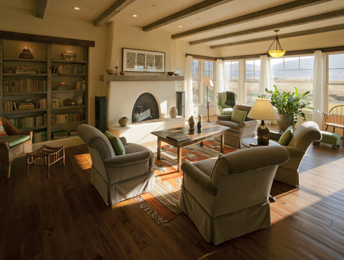
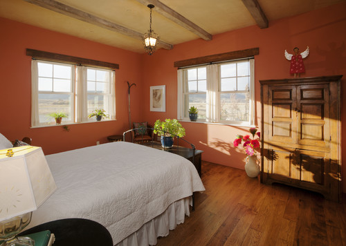
Image via Home on the Range on Houzz

Image via Pinterest

1 Comments